Restructuring a complex account for clearer navigation and task completion
National STEM Honor Society is an NGO focused on inspiring students to pursue STEM learning. NSTEM works with schools’ Chapters to create a sense of belonging to the STEM society through learning opportunities, rewards and more. The organization has requested an audit and a redesign to help them improve the current user experience.
During the UX audit of educators’ account multiple issues were found: inconsistent design patterns and UI, no clear action indicators and no explanation for any of the account’s functions. In a Service Safari exercise, the users who signed up and paid for a Chapter, landed on the account and did not know what to do next.
I redesigned the account experience from registration to setup. The goal was to restructure the account so that educators could take the full advantage of NSTEM’s features.
THE PROBLEM
The current account lived as subpages for the homepage rather than a system built for managing educators’ data – therefore the navigation and footer stayed the same for the account experience.
Besides that, the dashboard itself was overcomplicated – divided into 7 subsections with most of them divided even further with more tabs. Each subpage was also text-heavy to explain what is or isn’t possible in the account (also due to multiple manual processes behind the screen).
Auditors and myself needed several interviews with the stakeholders to understand what is expected of the customer at the stage after Chapter purchase.

The current experience. Text-heavy, no clear CTAs and multiple navigations visible at once.
THE GOALS
The goals were for the users to be able to confidently go through the account setup flow and fill in all the necessary information in an efficient way with little to no Support intervention. I aim to measure time to task completion and user satisfaction rate with a usability testing planned for the beginning of 2027
HYPOTHESIS:
If we update the account information hierarchy and provide clear calls to action, we will increase user satisfaction and task completion rates.
THE SOLUTION FOR A CONFUSING DASHBOARD
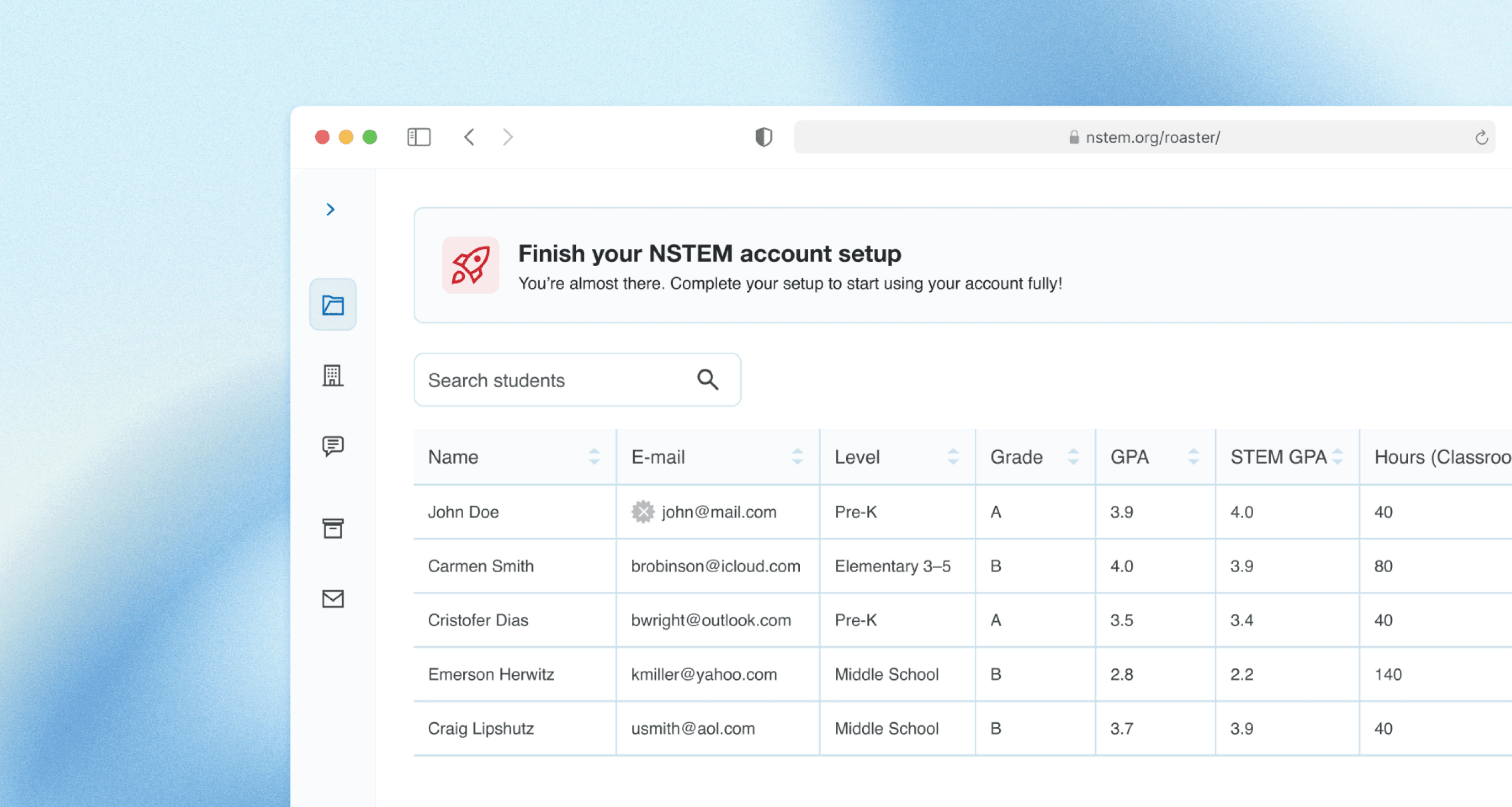
While the competitors’ user accounts were closed behind paywalls, I’ve analyzed layouts of successful yet complex products and walked away with patterns of what worked well – separate environment for the account, simplified sidebar navigation and clear CTAs.

Sidebar navigation that surfaces only the most important categories
Clear contextual CTA’s based on users’ actions
The Roster now functions smoothly and lets educator quickly add, edit and invite students to NSTEM.
THE SOLUTION FOR USERS WHO DIDN’T KNOW WHAT TO DO NEXT
To increase the account setup completion rate I’ve created a task list feature with the aim to make users aware that they need to fulfill multiple actions so that the account setup is finished.

Clear path to account setup completion
Two of the tasks would be marked completed automatically within the system trigged at filling in all information required in the Chapter info and Bylaws tabs. Finalizing the action of filling in the Roster would be manual as there’s no required number of students that the Chapter can have.
I’VE EXPLORED AS WELL

I’ve rejected the floating action button idea, because I didn’t want this feature to draw attention away from the main screen and wanted to avoid a potential crash with the cart floating button.

I’ve rejected the permanently visible list because it was taking too much space and competing for attention with the main action.
OUTCOMES & LEARNINGS
Usability testing planned for the beginning of 2027
The stakeholders approved the design and it is scheduled for development
The competitors accounts were closed behind the paywall, so I’ve analyzed layouts of successful yet complex products and walked away with patterns that worked well – separate environment for the account, simplified sidebar navigation and clear CTAs.
CLIENT
National STEM Honor Society
ROLE
UX / Product Designer
TEAM
1 designer (me), 5 stakeholders
STATUS
Scheduled for development